Looking Up the New WordPress VIP Product Documentation Portal

Let’s face it. Who hasn’t given up on an org’s internal search function in favor of “just Googling it” when searching a site for important product documentation, feature definitions, articles, and how-to guides?
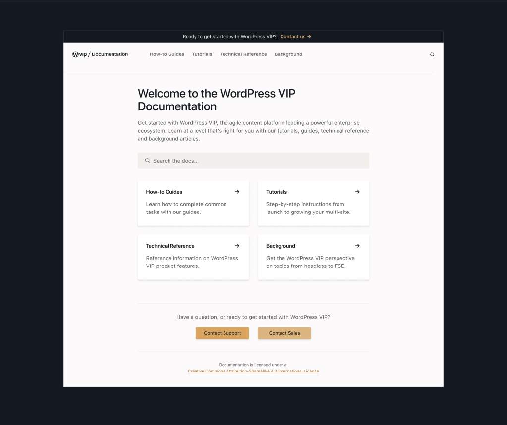
Acknowledging this dilemma, over the past months, a WordPress VIP strike team including content architects, technical account managers, designers, and developers rose to the challenge of completely overhauling and refining the WordPress VIP Product Documentation Portal “to help customers help themselves.”
Their mission: make that portal as agile as the WordPress VIP CMS platform itself to get users to the documentation they need quickly, easily, and accurately.
Here’s an overview of what came to be known as the “Great Migration,” including goals, challenges, and surprises along the way, in the words of those who made it happen.
Challenges with the previous WordPress VIP documentation site
“The old documentation site was more like a documentation blog than a tool our customers could use for reference and problem-solving,” says Product Designer Emily Maurer. “Content was organized in a big index and articles often had titles that were either much too broad or much too specific to be a helpful starting point for a person with real questions.”
In short, the old WordPress VIP site had plenty of information, but finding it wasn’t easy. Or a joy. Plus writing styles were inconsistent, and some content was outdated.
Search and writing style issues
Customers didn’t have much visibility into available topics. They were very reliant on search, but existing search functionality wasn’t robust enough. There was also an inconsistent navigation experience between different page templates that were used for “guide book” posts vs. self-standing posts.
In addition, the old site hosted playbooks that addressed particular audiences or workflows. When information was relevant to multiple playbooks, it had to be manually duplicated into each one. Result? Duplicate content often resulted in identical search results, making it difficult to distinguish unique content.
The writing style and intent was inconsistent across articles. Worse, in one article, a user might randomly be taken from a section focused on problem-solving—listing steps and specific use-cases—to a section on definitions.
Content was mixed with no rhyme or reason to help users sort through it all. Research showed that users typically relied on search to navigate the docs; however, even internal WordPress VIP colleagues found using Google a more reliable search method vs. using the search function on wpvip.com.
Goals of the redesign
“Our primary goal was to create a resource our customers could reliably use to solve their own problems,” says Emily. “We broke this larger goal into more specific goals for information architecture, content, and user experience design.”
Those goals included:
Information architecture. Update the information architecture of the docs to support users in accomplishing real-world tasks.
Writing and content. Unify the voice across articles and optimize those articles with a more goal-oriented approach, supporting users in accomplishing specific tasks.
Search. Implement a more robust, reliable full-featured search experience, using VIP Search. Users shouldn’t have to resort to a Google search to find the content they need.
Navigation. Create an experience that directs users to information they need to accomplish their goals and solve problems.
Visual design. Unify the visual design of the documentation with other WordPress VIP properties and products, e.g., the dashboard and marketing site.
“Being able to organize content more intuitively… makes content more human browsable, providing multiple ways for users to discover content.”
— Yoli Hodde, Content Architect, WordPress VIP
Scoping things out
Key was determining that the new documentation site needed to be a subdomain of wpvip.com, separate from the marketing site the public images with.
“We knew that wpvip.com is a marketing site aimed at potential customers,” explains Technical Account Manager Ken Gagne. “It serves a different purpose from one meant for developers who are actively trying to make the most of the WordPress VIP platform. That led us to create two sites with two kinds of content to serve two distinct audiences.”
Still, there was initial concern about breaking off the docs content into its own site. One reason? Parse.ly analytics, part of the WordPress VIP platform, consistently showed those docs already had high SEO value. But retaining that value could be kept intact by moving it to a subdomain of the primary company domain.

The site evolution and guts
“We’ve worked over the past year to establish categorical organization that is more intuitive for users and is more consistent with the way we internally group different platform features and the teams that work on them,” says Content Architect Yoli Hodde. “Our platform has undergone dramatic changes, too, so staying aligned with a moving target has been a challenge. Our categorical structure will likely always be a work in progress.”
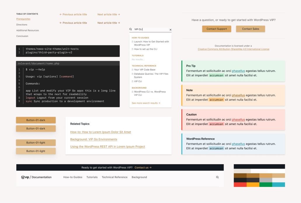
On the technical side, the documentation portal is a Gutenberg-heavy site that uses custom and core blocks to display relevant content. The site utilizes custom post types along with their archives to separate out different types of documentation content. Front-end dynamic elements are built using Svelte, search uses VIP Search.
“I love that as a user, you can approach the docs and have a much better idea of where to start and what your options are than you ever did before.”
— Emily Maurer, Product Designer, WordPress VIP
Designing the redesign
Emily proposed the information architecture strategy for the docs, led the audit of the existing docs content of the docs, and developed the visual design and user experience of the site and managed hand-off of components, styles, and intent to developers. This gave the rest of the team a framework for re-distributing and syncing the content that aligned with the new content types (reflected by custom post types).
Robby Smith, a developer with design agency Reaktiv, helped develop the redesigned docs portal.
“We had worked on the previous wpvip.com marketing website, and understood the difficulties WordPress VIP was experiencing with their documentation articles,” he says. “We wanted to help them take a new approach to handling and maintaining documentation.”
The Great Migration
En route to its new home, existing documentation post type content had to be extricated from the marketing site on wpvip.com.
The decision was made not to “lift and shift” the content with its existing organization and relationships to the new site. Instead, the team identified an improved hierarchy of categories to organize the content and improve browsability between articles. This added extra effort when moving each article manually from the old site to the new site. But it also allowed a chance to identify content that could be deprecated or “scrubbed” with needed fixes.
As part of the launch steps and QA, the team ensured all internal or external links to the old documentation would successfully redirect to the corresponding new content, setting up 301 redirects in WordPress.
Ken even recorded an internal tutorial video to guide team members who helped with the content migration. As a precaution, before the old site vanished, its documentation was submitted to the Internet Archive’s Wayback Machine (a digital archive for the web) for historical reference. In addition, the team exported documentation posts using WP’s WXR export tool as well as a copy of the SQL database.

Unexpected difficulties during the transitioning
The team occasionally discovered orphaned informational nuggets and had to perform a post-launch excavation from the old site.
“Our old site had an FAQ, a ‘junk drawer’ for miscellaneous information that didn’t warrant its own dedicated page,” says Ken. “With the new site, we found homes for each of these morsels, nestling them into existing pages or relevant hierarchies.”
Because these individual FAQs didn’t have their own dedicated URL on the old site, “we were unable to redirect their anchor tags to their homes on the new site,” Ken adds.
Highlights and favorites of the redesign from the team
“The updated design is my favorite thing—I love the multiple scrolling elements and the updated look,” says Robby. “The content organization comes a close second, as it’s much easier to find the content you need quickly.”
“Being able to organize content more intuitively with categories structured to better reflect the infrastructure of the WordPress VIP platform,” says Yoli. “It makes content more human browsable, providing multiple ways for users to discover content.”
“The way content is organized, easier to find, and materials divided into How-to Guides, Technical Reference, and Backgrounds,” says Technical Account Manager Nabaht Peters.
“I love that as a user, you can approach the docs and have a much better idea of where to start and what your options are than you ever did before,” says Emily. “I also like that it actually feels like documentation, not just a blog.”
“The little things like the ‘Last updated’ automatically generated timestamp, and the CC-BY-SA 4.0 license,” says Ken.
Looking ahead
WordPress VIP’s documentation will continue to improve and expand the depth and breadth of the topics covered.
“Future work includes collecting groups of links that are useful for different stages of a customer’s journey with WordPress VIP,” says Yoli, “whether they’re newly onboarded and looking for basic guidance or are ready to begin working on their own site redesign.”
Meanwhile, got a burning question about how WordPress VIP works from a technical perspective? Or just want to explore what purpose built and improved information architecture feels like? Dive into the WordPress VIP Documentation Portal now.
Let us know what you think.